Lane Powell Website Redesign
STUDENT WORK
Discovery a problem
Before I started working for them, Lane Powell PC., a Pacific Northwest law firm headquartered in Seattle, went through a rebrand, and like when most rebrands come around, the need for a new website does too.
During this time, I took another UX class through the San Diego Portfolio Studio in my free time, still not fully ready to leap into UX but enjoying the ride and the stimulating challenge it offered. So I needed a problem to solve and a friend at Lane Powell sent over the new branding the firm was working on. What he sent wasn't final, but it sparked my interest with its bright saturated persimmon. It was such a bold statement and stood out to me, but when I looked them up I discovered the site was well past its expiration date and required some TLC, so I decided to take it on.
Asking Question & Defining the Objectives
It started with exploring their current site, taking inventory of the content, noting questions and thoughts of possible information refinement. Looking at what information seemed to be the most important. At the time, I had no experience with law firms, and so this step was vital.
The next step was to articulate what my objectives were and start laying the foundation for the site's vision utilizing what I'd learned from the current website and the new branding materials.
the Problem
Statement emerged:
Lane Powell requires a modernized and streamlined website with straightforward navigation, engaging graphics, application of their new branding, and the establishment of clean and versatile modules for different types of content to align with their vision of being a world-class firm that offers extraordinary talent, exceptional leadership, and thoughtful guidance.
How do you make a law firm approachable to such a large and diverse audience?
Next, I started to take a look around at other law firm sites and corporate sites. How did they deal with large amounts of information necessary for this type of site? Were there reusable patterns? How were they using color? The current Lane Powell site didn't utilize many colors, was this standard in the industry? How did they make the content engaging for the viewer? How did they gain their audience's trust?
Defining our users
I needed to take a deeper dive into the users I'd outlined in my questionnaire. Who were these people? What was important to them? How did they use the site differently from one another, and were there any overlapping themes, and if so, where?
I needed to cover a ride range of ages, specialties, and demographics—their experience with lawyers and law firms needed to vary as well as their interests. Through my research, I crafted three different personas.
Synthesize & Information architecture
With my users defined, I started synthesizing the content, thinking about how they would moving through the space and what their priorities were. Not having access to the firm made this more challenging, but I was able to find common themes in attorney profiles and weed out some redundancy. Through card sorting, I was able to simplify the main navigation and move some lesser items into secondary locations to allow for a more straightforward and more concise nav bar.
One of the most considerable challenges with the site was the amount of content, which there wasn't a way around. If attorneys were anything like real estate brokers (and I later learned in some ways they were), there would be no corralling them with a word limit. Even though I had streamlined some of the content, I still needed to ideate solutions for not overwhelming the viewer with copious amounts of content while still making all that content available.
This was a challenge for down the line; I still had other things to figure out but it was important to keep this challenge in mind as I moved forward.
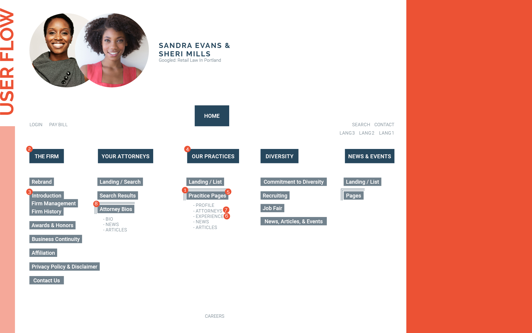
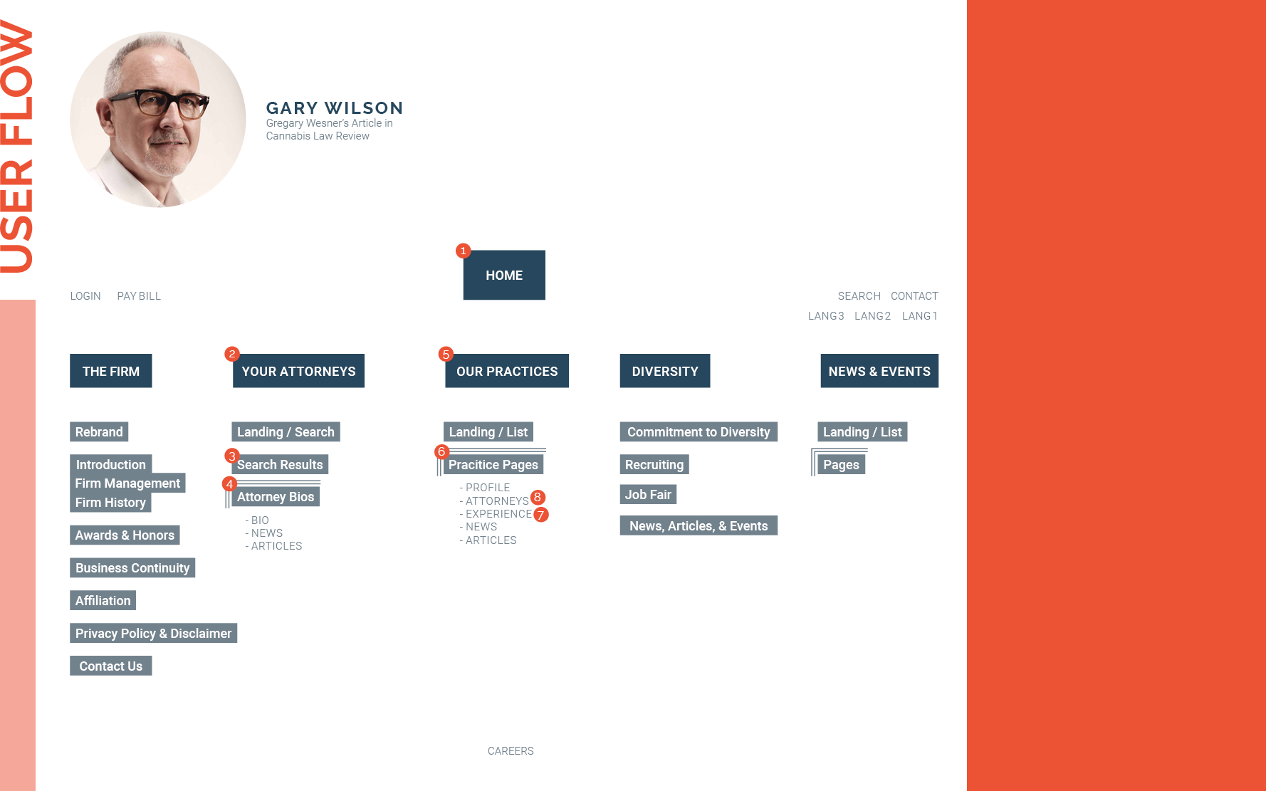
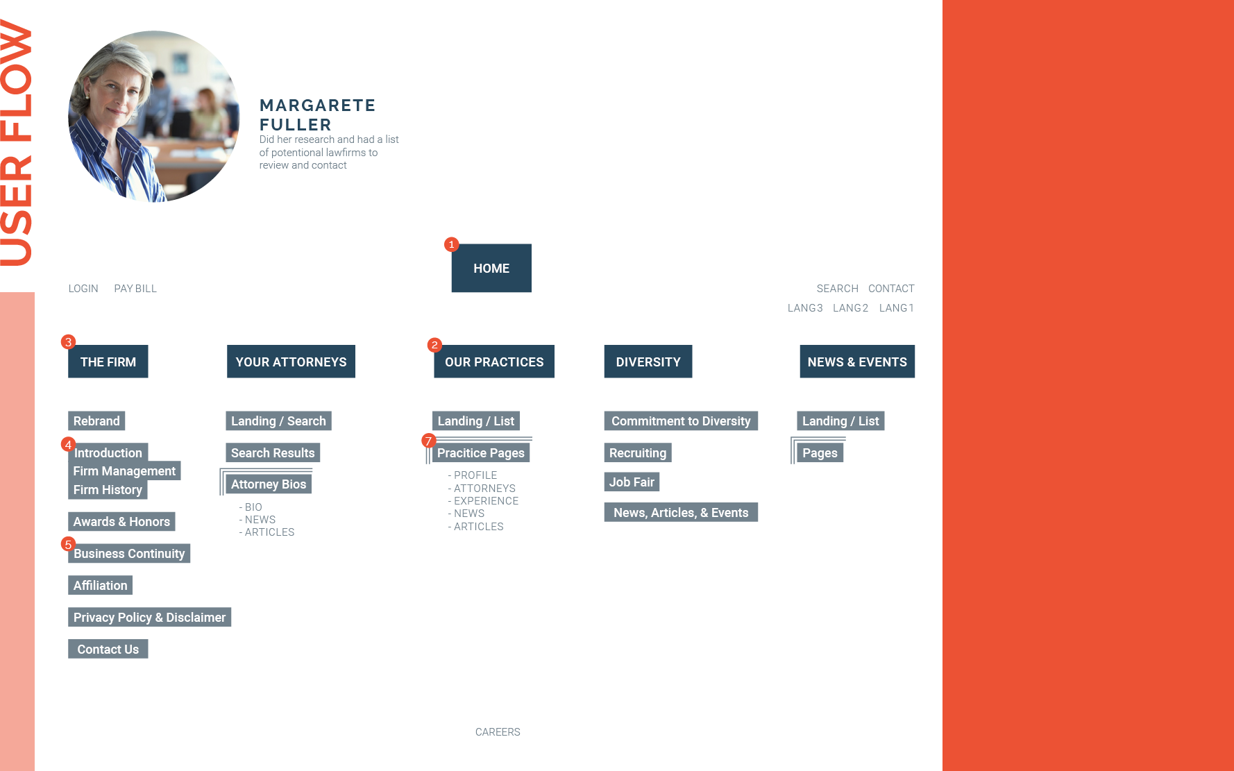
With the information architecture nailed down, it was time to look out how a user might move through the site, noting that they might not always be landing on the homepage when they do.
Form vs function
For me, the next steps become a bit of a hodgepodge (do people still use that word?) #eldermillennial
Coming from an art and design background and being a visual learner, sometimes the visual side of things comes into focus before the actual structure. And to be honest, I find it can help save time. Having a firm understanding of a project's look and feel can significantly impact and inform the structure and help weave the two together. Specifically, in this case, it was essential to get the feeling across to the audience. You always want to consider function when constructing any user interface, and sometimes function outweighs form, but in the case of this project, look and feel we're going to play a vital role in this redesign's success. It's what was going to help gain the audience's trust and determine the firm's approachability.
I needed to think about the attorneys; what did the aesthetic of their headshots look like? What style would be both dynamic and approachable? How could shapes and colors be used? What would they look like in a palette that was primarily going to be orange and grey? We'd want to stay clear of black to avoid the Halloween connection. Which then brought up the question, how did white space fit into this equation?
The rebrand's primary color already made the brand more friendly, young, and exciting, so I started there.
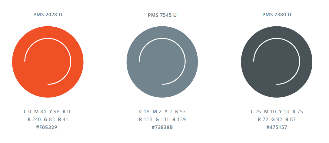
With the rebrand not finalized, I took some liberties and expanded the palette but focused on that striking orange. I worked to find the right color combinations that told the story I wanted. Lane Powell was a firm with over 140 years of experience and not a startup, so while it needed to be modern, it also needed to be grounded to illustrate its history.
I like the primaries they had so far but felt that the darker grey didn't send the right message. The palette also needed contrast, and I found it in a smoky dark blue, which balanced the bright saturated persimmon and the lighter grey, and grounded the palette. The secondary palette went through several iterations, and the results were variations of the two central primaries. These would be used sparingly and only when elements needed to standout.
As a designer, I have an affinity for fonts. It's pretty much a requirement; to say otherwise means you can't sit at the cool kid's table, like ever. That said, an affinity for them doesn't make them easier to choose because a font isn't just a font. They become design elements within marketing colleterial in both print and on the web. They set the tone for a brand, so getting them right can take some time.
The brand needed a font that showcases the firm's bold move to the 21st century; it needed something with just as much attitude as that persimmon but couldn't be in your face; this was a law firm, after all, with a lengthy lineage. Enter Raleway, a sleek sans serif with a hidden attitude with a lowercase e with a bit of an overbite and W's that crossed in the middle. Just enough 'tude to be exciting but not annoying.
Roboto Slab would serve as the primary heading font with it's a hint of something old (maybe typewriters of yore?) but with a beautiful modern sleeve.
There’s always Room for Improvement
A big challenge with this project was making the law firm approachable and elegant, and I feel I scored about 90% on that aspect. I fell short in the practice page header graphics. I think they might have worked for a small firm with fewer practice groups but creating playful, well-illustrated designs for each team that were sustainable over time wasn't feasible, and here's why:
Each practice comes with its own audience. There may be multiple sub-audiences within those audiences, and working outside the box with that many stakeholders in the mix is an arduous task that ultimately wouldn't end up cohesive. I enjoy using design to push the boundaries of the corporate structure, but it needs to be the right fit, and this wasn't it.
The design overall was a great success! It garnered the right amount of interest and approachability while remaining part of the fold, so to speak, which filled the brief beautifully.
Setting the Stage
Navigation
With the aesthetic well outlined and my information architecture thoroughly in place, the design structure came together pretty rapidly. The audience needed the navigation to be readily available to discover what Lane Powell had to offer them, so the primary navigation needed to be front and center. This obviously changed for mobile but remained easily accessible through the hamburger menu and was laid out clearly and cleanly followed the secondary navigation and social platforms.
Homepage
The homepage needed to flaunt what the firm was up to, showcase its exceptional attorneys, and the great work they were doing. It needed areas for bold imagery and dynamic text and different ways to promote upcoming events and the publications their attorney had diligently written to keep their clients and the public informed.
Firm Overview
Carrying through the theme of the homepage, the firm overview page needed to showcase what the firm was achieving year after year.
Attorney & Practice Parent Pages
For the Practice and Attorney parent pages, searchability was vital to make them accessible to the users. This became particularly true for the Practice page on mobile. With over 40 practice teams, they overwhelmed the screen and the user. The idea behind the search bar was to make them easy to navigate.
OPPORTUNITIES FOR ENHANCEMENT
Both of these deserve a retake. Working for Lane Powell, I understand that there was an opportunity to categorize these practice groups making them more accessible and easier to navigate. As for the Attorney landing pages, there were a couple of missed opportunities. This initial landing page could help present some friendly faces right off the bat by highlighting a few attorneys; currently, it feels a little cold. Additionally, I think the removal of the quick link alpha navigation was misguided and should have been adapted for mobile as well.
Individual Practice Pages
The time had finally come. I needed to address that dreaded amount of content for both the Individual Practice pages and Attorney Bio pages. I found that the Individual Practice pages could be broken up into three sections, which would work well with tabs.
Attorney Bio Pages
There wasn't time to perform usability testing for this class, but I plan to continue and evolve this project over time. As I've mentioned, I would approach several things differently; that said, the final designs came together quite successfully, and I was delighted with the end product.
There wasn't time to perform usability testing for this class, but I plan to continue and evolve this project over time. As I've mentioned, I would approach several things differently; that said, the final designs came together quite successfully, and I was delighted with the end product.


